STAR ENGINE - COLOR PICKER
Role
UX Designer for the Editor Team @ Cloud Imperium Games
Tools
Qualitative Interviews with Lighting, Character, and Material Developers
Miro for Notes, User flows, and Mockups
QT for the UI
Case Study Contents
Problem Discovery
Breakdown
Competitive Analysis
Results
Conclusion and Post-Mortem
Problem Discovery
Editor team was tasked with improving our color picker and our artists wanted a color picker with modern visual refinement, layout, and interaction.
Alongside my engineer Albin Engström, we set out to create a compelling color picker ready to meet and exceed user needs!
Our old Color Picker was an ancient relic and our developers who frequent the Tool knew this and requested an update.
Users weren’t too specific with their initial request, so I began interviewing various departments who interact with it on the regular and discovered the following:
“it’s not great” - most developers
Lack of modern interactions compared to other software packages and online tools
No direct connections to their pipelines, lighting, Characters, and anyone using materials
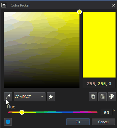
Tool Breakdown and Analysis of Current Features
How do artists utilize the current features and what features are lack luster?
Basic Color Swatches
Good
For any designer, this is a frequent destination for developers who are NOT Artists. They quickly pick swatches for Color Coding our Level Layers - and basic grey-boxing stages for materials
Limitations
Users are limited to these color swatches and no others with exception of making their own below, in the area Custom Color Swatches
For Lighting Artists / Cinematics, Character, Vehicle, or Environment artists - they rarely choose a color that is not determined prior. These colors are Basic, but not “Advanced” per our developers pipelines
Pick Screen Color
Just below the Basic Color Swatches is our “Pick Screen Color” Button, aka the Eye Dropper tool - which allows users to cursor over a pixel on their monitor and select the Color.
Good:
Allows users to pick any color on their screen.
On the Hue Spectrum and the Color Selection area underneath, the color updates.
Custom Colors Section
Good
This section provides our users with the ability to store a Custom Color not provided by the Basic Colors.
Limited Click and Drag functionality from one square to the other
Limitations
16 Custom Colors, no more.
Users can easily overwrite a Custom Color Swatch by accident.
Does not contain any libraries for materials and their colors for reference
Steppers
Good
Having Fields for the HSV, the RGB, and the “HTML” aka Hex are all needed for our lighting artists, but not all users wanted them displayed at the same time.
Limitations
These Steppers have no interactions that allow faster precision of any kind, which infuriates modern users.
The HTML field didn’t understand or restrict Hashmarks #, so if an artist put in a Hex with #, the field wouldn’t identify the color
No good way to Copy and Paste any of the Values, Html #Hex
Competitive Analysis and Explorations
Any color picker referenced by our developers, we examined. Amongst others which exist all over the internet.
Most every color picker has little variation in Primary features:
Select a color from a spectrum or associated color band, modify the color via the Canvas or via Sliders, Save it. Move on.
Compare new color to the old one
Quickly swap between color a user stores
HSV, RGB, Alpha, Hex values
Have a Live Preview of the change on the selected object, and Confirm / Apply those changes.
What makes certain Color Pickers standout however - is the supportive Secondary features:
Compact / Expanded window
Drag and Drop
Slider
Swatch Management and Swatch Libraries
Keyboard shortcuts
Having the ability to reference a Color located on an already established Object
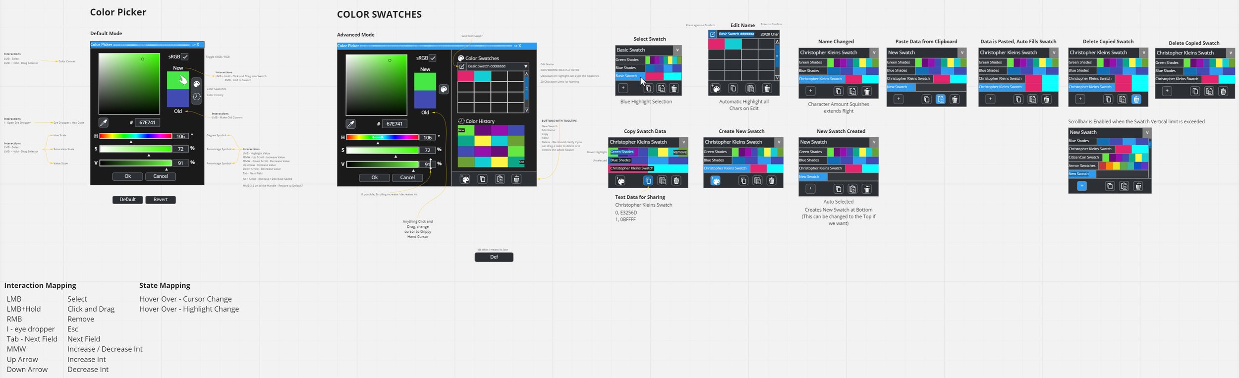


As we worked with our developers, we tried various shapes and layouts. We were working towards a blend of Compact and Expansive. Here are some mid-fidelity mockup variations made in Miro.
Sizing of Components, Scaling of the modal itself, slider type, clicking and dragging, hover shortcuts, etc.
Every variations brought us closer to the final product detailed below, and meetings with our developers lead to more useful feedback.
A Cooler Picker
Color Picker Results
Shortcut Showcase
Hover over a Sliders Manipulator and use Middle Mouse scrollwheel to Increase or Decrease
Value Fields allow users to use Up & Down Arrow Keys to Increase or Decrease Values
i - to use the Screen Picker
Ctrl+C - Copy as RGB
Ctrl+Shift+C - Copy as Hex
Ctrl+V - get Clipboard
Ctrl+Z - Undo
Ctrl+Y or Ctrl+Shift+Z - Redo
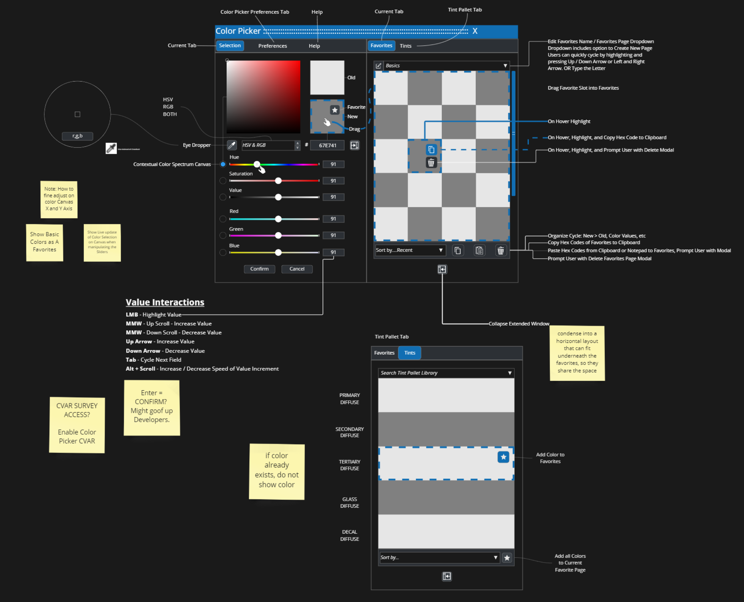
Screen Picker Magnifier
We took inspiration from Figma and added our own variation of the Magnifying Eye Dropper tool, converting our Color Spectrum area to the Magnifier. (Seen in the .gif below)
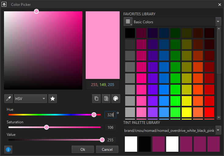
Color Libraries
Whilst the entire layout and interaction improvements are great, the “Color Libraries” are the real star of the Color Picker.
The Color Libraries is composed of Two Sections:
Favorites Library
Tint Palette Library
Favorites: Libraries
The Favorites Library replaces our previously finite Custom Colors Section with the ability to have as many colors as they want in a Favorites Library.
Users can also create more Favorites, rename them, and share entire Favorites Pages with another coworker.
Favorites: Quick Interactions
We wanted to push quick interactions of clicking and dragging in as many places that made sense for a users workflow.
We have shortcuts for Favoriting Copying, Pasting, and using the Screen Picker.
As a Standard going forward for each improvement for our windows and tools, we include a direct link to our documentation on that tool. This is the Blue ‘i’ icon bottom-left of the interface.
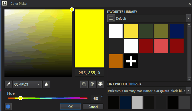
Favorites: Modifying and Sorting Favorite Pages
We offer users the ability to create, modify, delete, and Sort by Hue, Saturation, user order, change the Size and Shape of the Colors in the pages.
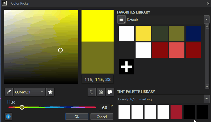
Tint Palette Library
The Tint Palette Library is where our preestablished color palettes for various in-game branding exists. Typically this is within another window all together. Through our interviews we saw these users go back and forth and we had to utilize the ecosystem connection. It was a big win with our developers.
POST MORTEM
Whilst a great little success story with our developers and meeting their expectations for function and features, we also had a fair amount of issues on release worth mentioning that we are tackling post-release.
Small but Fixable Problems
Didn’t have HAIR nor SKIN Canvas’s at launch.
We defaulted to RGB instead of Hex, which artists prefer even though we accept Hex and convert to RGB. There was a mix up when looking at other parts of the Editor which utilize RGB Fields.
The modal is doesn’t allow the user to freely access the viewport, it was very much locked into a choice, leading to developers wanting a more “free range” live editing modal.